Charbel
Establishing clear, consistent visual identity options for a premium realtor.
Sr. Graphic Designer: Richard Sanchez
Establishing clear, consistent visual identity options for a premium realtor.
Sr. Graphic Designer: Richard Sanchez
The client needed a sophisticated and trustworthy identity to elevate their presence in a very competitive real estate market. Their existing branding lacked the clarity, polish, and flexibility required to communicate their premium positioning.
With the goal of creating a stronger, more defined identity, I developed three unique logo directions that each highlight a different side of the brand. Together, they build on the client’s story, moving from conventional real estate visuals to a more intentional, refined identity.
Although the project ultimately did not move forward, the exploration demonstrated how strategic design and clear visual systems can elevate a brand’s perception. These directions represent distinct yet cohesive approaches to expressing a premium real estate identity.
Project Type
Logo Design
Role
Sr. Graphic Designer
Delivarables
Wordmark, Icon
Tools
Adobe Illustrator, Live Surface
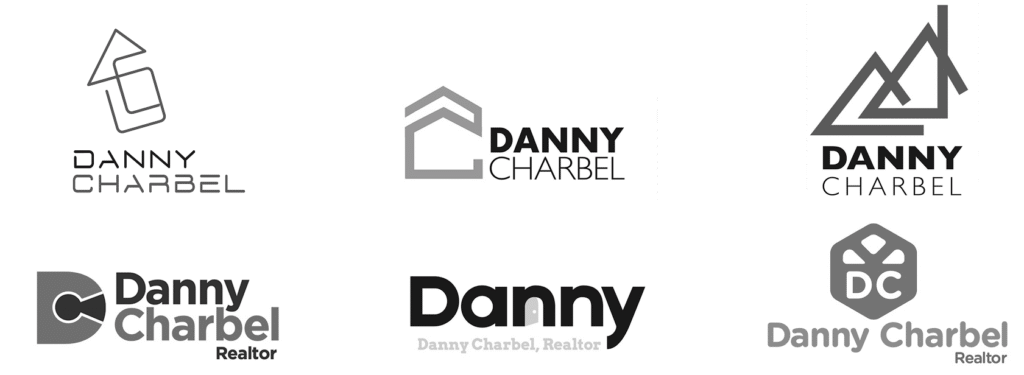
Before I joined the project, the client explored a range of logo concepts with another designer. The earlier designs (left column) leaned heavily on common real estate clichés—keys, houses, doorways—which made the brand feel generic and easy to overlook in a crowded market. The current logo in use sits in the right column.
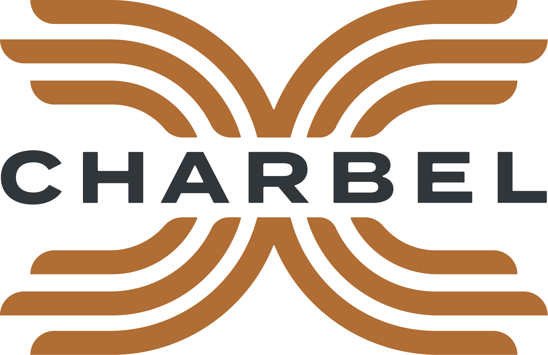
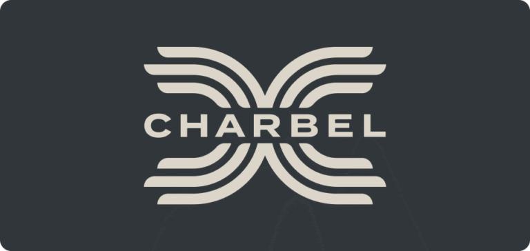
This concept channels a confident, forward-moving energy anchored by a strong central identity. The staggered lines forming the “D” and “C” subtly reference the client’s initials, paying homage to his personal connection to the brand while reflecting six core qualities: trust, support, expertise, momentum, resourcefulness, and reliability. The name Charbel at the center ties these values together, creating a clear and cohesive mark. Varying line lengths emphasize adaptability and intention, qualities that help the brand stand out in a competitive market.
The completed identity builds on those ideas, bringing structure and motion into balance. The interwoven lines create a sense of direction and strength, while the symmetry conveys stability and trust. A warm, earth-based palette drawn from the textures of city architecture, including stucco, clay, and wood, grounds the identity in familiarity and approachability. Together, these elements form a mark that feels confident yet grounded, designed to communicate reliability, expertise, and forward momentum in every interaction.
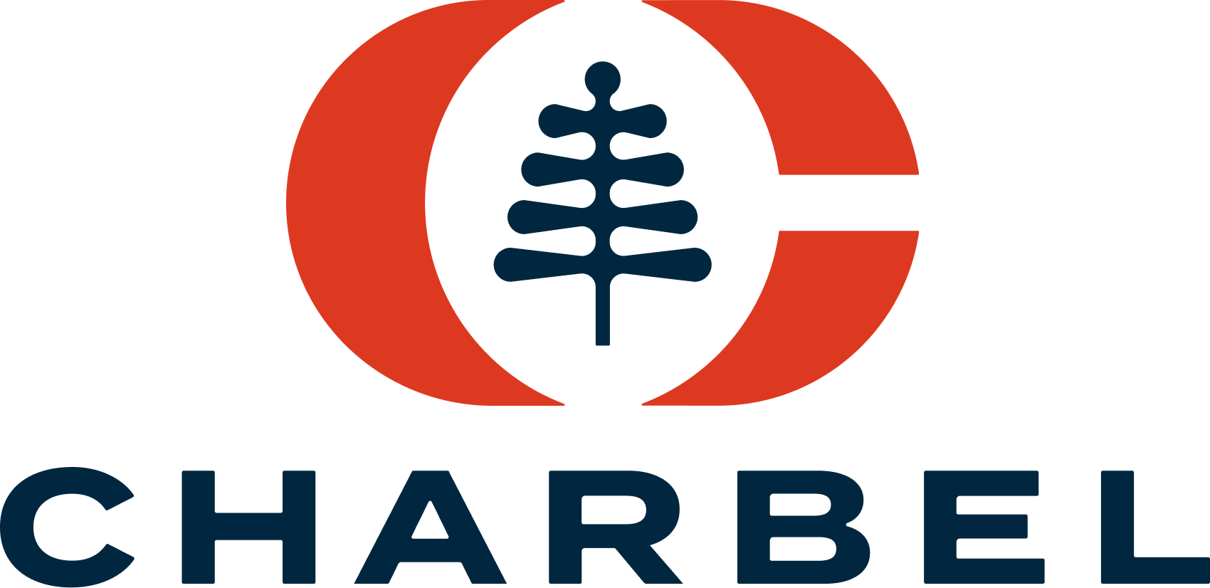
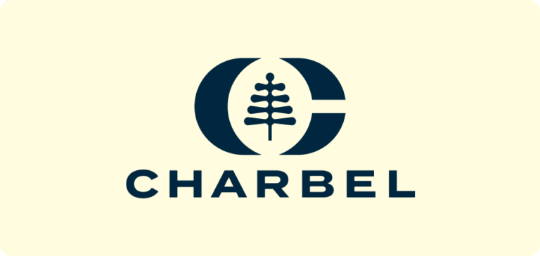
The Charbel identity was designed to feel both personal and premium, a reflection of the client’s Lebanese heritage expressed through a modern, American lens. The design draws inspiration from the Lebanese flag, specifically its bold red bands and the cedar tree, a national symbol of resilience and longevity. The cedar’s meaning of endurance and rooted strength became the foundation for the identity concept, blending cultural symbolism with the client’s modern real estate presence.

Building on those ideas, the cedar was reinterpreted as a simplified geometric form—colored in deep blue to represent stability and subtly nod to the client’s American roots. Framed within a bold red “C” for Charbel, the mark feels strong and balanced while maintaining a refined minimalism. The open letterform breaks at the top and bottom, creating three distinct pillars that represent resilience, reliability, and connection—values that define both the client and his approach to real estate.
The red, white, and blue palette bridges both cultures with quiet confidence, resulting in an emblem that feels timeless, grounded, and enduring—rooted in culture yet built to inspire trust.

This direction explores a more personal expression of the brand, shaped around the client’s initials. The form is built from a custom monogram where the “C” is nested inside the counter of a bold, structured “D,” creating a symbol that represents Danny Charbel as an individual while still aligning with the broader Charbel identity. The idea grew from the client’s desire for a mark that could stand on its own, something recognizable enough to work on signage, merchandise, or a keychain, similar to the iconic symbols used by top-performing agents in his market. This approach focuses on creating a unique, ownable mark that is both personal and professional.
The completed monogram balances bold structure with refined detailing, giving the symbol a confident and timeless presence. Its concentric contours create a sense of movement and depth, helping it feel modern while maintaining clarity at small sizes. When paired with the Charbel wordmark used in the other directions, the monogram integrates seamlessly into a broader brand system, giving the client flexibility to use it independently or within a full logo lockup. The result is a signature mark that elevates the client’s personal identity while remaining versatile enough to represent a growing real estate business.
